How to Use a Toggle in SwiftUI
Want some type of control to switch between on/off? That’s exactly what Toggle does in SwiftUI!
Often times in apps you’ll find switches for things like turning push notifications on or off. That’s cool, but you know what’s even cooler? Lots of things. Probably. But we’re going to throw cool things to the side and create a view that changes the color of a circle using a Toggle in SwiftUI!
Setting up the view
Similar to the Segmented Control from a previous tutorial, Toggle relies on a state property to keep track of if it is on or off. Start by adding one to the top of your SwiftUI View:
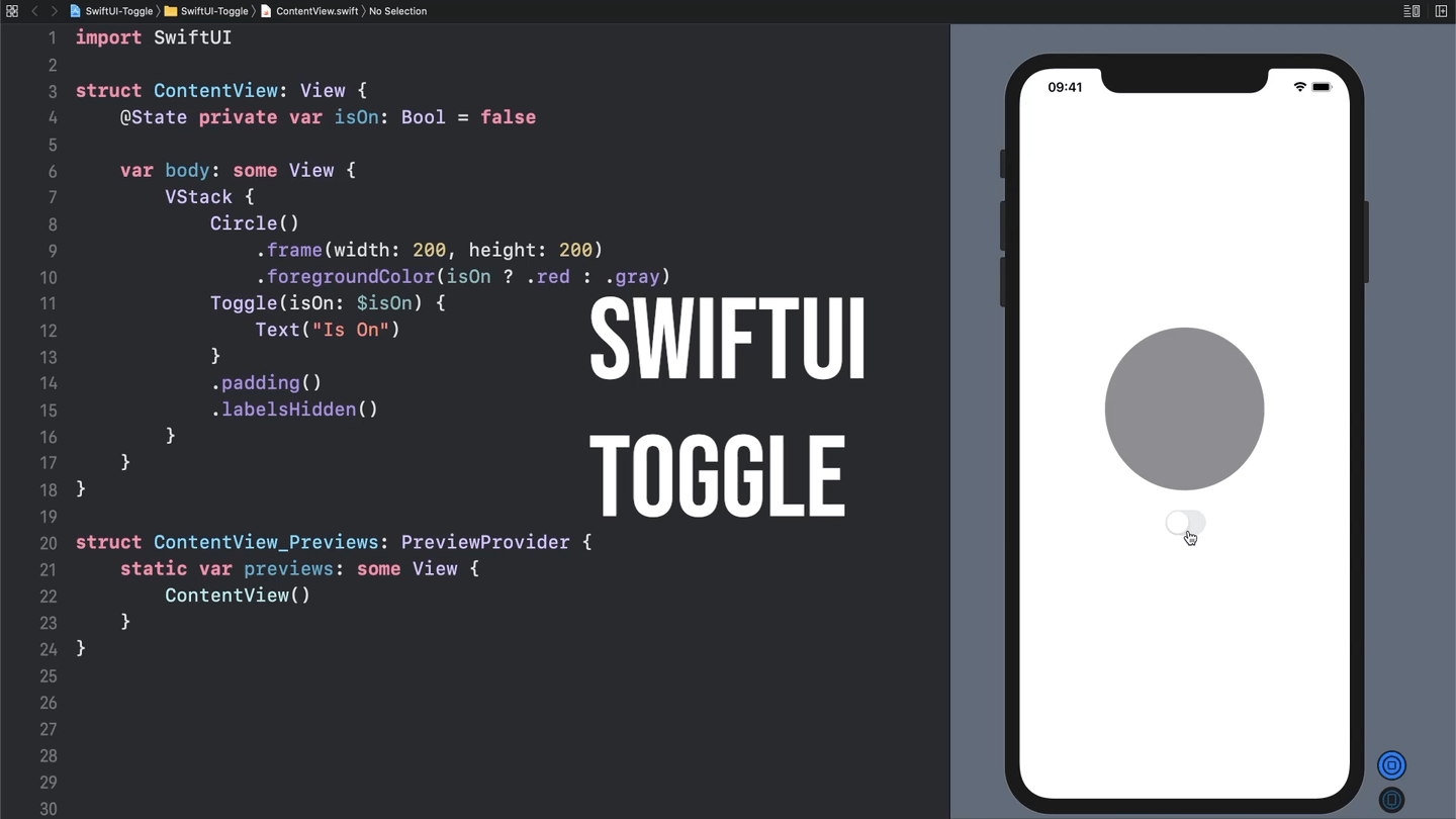
@State private var isOn: Bool = falseNext, we’ll need to create a VStack to hold our Circle, and ultimately our Toggle:
VStack {
    Circle()
        .frame(width: 200, height: 200)
        .foregroundColor(isOn ? .red : .gray)
}
OK so now we have a circle, and as you can see from the foregroundColor in the code above its color will change from gray to red based on if our state property, isOn, is true or false.
Creating a Toggle
Next up is creating the Toggle to change the value of isOn. Add the following to your VStack:
Toggle(isOn: $isOn) {
    Text("Is On")
}
This code creates a new Toggle, giving it a Binding to our isOn property so that it can read from and write to it. In addition to the isOn Binding we’re passing it some new Text as a label. The label is basically a description of what the Toggle is for. By default the label displays, but there’s an easy way to hide the label if you’d like. Just add the .labelsHidden() modifier:
Toggle(isOn: $isOn) {
    Text("Is On")
}
.labelsHidden()
And now you have a fully functional switch that controls the color of your circle!
Check out some other recent tutorials